•1) in what way does your media product use, develop or challenge the codes and conventions of current media products ?
In my research i found that codes come in two different categories Technical codes “are all the ways in which equipment is used to tell the story in a media text, for example the font and font size in a newspaper. "when making my product I took the technical codes into consideration and used them to form an effective paper that could be compared to existing ones. The main body text in my newspaper was written in font 9 which in my research I found was commonly used in broadsheet, tabloid and student papers. As I wanted to produce my magazine as a cross between a tabloid (the sun, the metro) and a student magazine I made the majority of my font in a serif style as this connotes a less formal, laid back newspaper as to a san serif font that connotes formality.
The other type of code is – “Symbolic codes show what is beneath the surface of what we see. For example, the size of the text in a newspaper, to show its importance.” I used this technique through out. Important information such as my mast head and headlines for the article and features were written in a large bolder font so they stood out on the page and gave the reader the key facts.
Conventions are the generally accepted ways of doing something. There are general conventions in any medium, such as the use of interviewee quotes in a print article, but conventions are also genre specific. In my product I used conventions of a local paper tabloid paper throughout.
Images: I used a large percentage of photographs in my paper as they are an effective tool that grabs the eye of the reader, on my front page I went against conventions slightly by not pairing the lead story with the biggest image, I used a medium size image and then wrote the article surrounding it with a headline written in a large bold typeface. I used the largest image for the secondary story which I only wrote a small paragraph to explain what the feature was about. By doing this I felt that the large image would draw in the reader to the front page then they would want to read the feature that went with it- therefore picking up the paper. The lead story the article was on the front page so it was the content of that which would get the reader interested.
I followed the convention of having a large mast head at the top of my page so it caught the readers attention and told the instantly what the pa per was called. I used the conventions of tabloid papers such as the star and the sun by making the name of the paper something short and snappy which would away in the mind of the reader- this being the point.
I also used the convention of having a strap line below my mast head which was a slogan which would be recognised by the reader of the magazine. Also on this I had some pugs that told the reader the price of the magazine- in this case it was free. This would draw in the reader as they would be drawn in by free word free.
The majority of the codes and conventions did match up to the existing papers it was mainly the content that did not. As the paper was a tabloid but one in which that was designed for 16-21 year olds
•2)how effective is the combination of your main product and ancillery tasks?
• I feel the combination of my main product and my ancillary is very effective. Throughout, I have developed a very strong identity as if it was a real company. I have done this with the constant use of the main colour blue which ties together the poster, web pages and newspaper. I have also used my logo and name on every task which unites them all.
• The content of the tasks all complement each other well. Lead stories in my newspaper have been mentioned on my website under a “featured” heading these include “the great debate”, “make do and mend” and “ why stay in.” this unites the two products as they both work as an advertising tool for one another. If someone was to read the paper they would find the same stories on the website and possibly even more, and likewise the user of the website may not know of the newspaper but be tempted to pick it up if they are impressed with the website.
• The poster works well to advertise both the website and newspaper as it clearly shows the name of the paper and below it the website for it. Either way if someone see’s the poster the bold and colourful fonts twill encourage them to do research to find what the poster is advertising. Especially as the poster uses third person “ the news you want” to directly address the reader and engage them.
• Both the main and ancillary products work well together to engage the target audience of 16-21 year olds as the content in them all had been specially used to interest and engage them. The stories are not the normal factual articles that you would find in normal tabloid or broadsheet papers they are specifically designed to help, entertain and interest the specified audience. Whether this be the article giving advice to young people about how to deal with the current rise in tuition fees in the newspaper or the comical real life story of an18th birthday that went horribly wrong on the website, they all work together to give the target audience local information and
• features that matter to them and effect their lives which is what the tag line says it will do.
• I have also used the website to clarify that the newspaper is in actual fact a local paper as I have mentioned local places such as Southend on a number of occasions. In both the website and paper. I have not done this on the poster but this is merely a marketing tool to get people to look at the other two products and this poster would only be displayed in the areas that the newspaper covers- the castle point of Rochford.
•
•3)what have you learned from your audience feedback?
website pages
with th ewebsite i knew i would be carrying through the blue colour scheme so it matched with the newspaper article. I found in my feedback among my class that they liked the boxes with curved edges so i decided to include these in my second page aswell as my first.
In conclusion i found that by collecting feedback i was able to make my project suitible for the target audience and the exam criteria. I found that it was important to take into consideration my audiences tastes and ideas aswell as my own becaus ethese are the people that would be reading my products.
•Throughout my media project I was able to get some helpful feedback from both my target audience and people that were not in my target audience. Despite my efforts at getting feed back by putting y work on social networking site “Facebook” I was not able to get as much feedback as I wanted. The majority of my feedback came from asking people in my class who could give me advise as they had media based knowledge and could give me ideas about the technical side of the product (the amount of columns and the size and layout of the pages) whereas by asking my friends who did not do media I could get an outsiders opinion as to “the look” of my magazine just by the comparing it with other ones they have read.
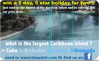
•By carrying out and asking for feedback among my peers at specific points in the creation of my project I was able to see what had to be improved and what was good and therefore carryon using. An example of this is when I asked for feedback regarding this advert
•I was told it needed contact information so people could enter the competition, I there for amended this problem accordingly.


Also by asking for feedback from the archetypical person in my target audience I was able to make my products in the knowledge that what I was writing about, and how I was writing about it appealed to the audience.
Newspaper pages
This was the first and main product I made, so I asked a lot of feedback regarding this as I wanted to ensure I was taking the target audience into consideration throughout the process . In the early stages I got a lot of useful feedback about the layout of my newspaper. This included that instead of three columns I should use five. Once my article wee written this gave my pages a more user friendly look as It made the eye trick the mind into thinking that there was not a lot of writing as the audience would be reading down not across, there fore making the page look more appealing and relaxed for a younger audience who do not want to be bombarded with information.
I also received a lot of feed back on the fonts and colours I was using, this all seemed very positive as some comment I received were that the “mast head is eye catching” and “ the colours stand out on one another. This encouraged me to carry on with what I was doing and add these features into the following pages.
The poster mainly received positive feedback as I had taken into consideration previous feedback about font sizes and colour which would make it look as though it was advertising the paper. One comment I did received that helped me was about the collage on the background and how I had repeated some of the images, this helped me a great deal as this was a small detail that I would not have noticed. But now I have done it I feel confident that the poster looks professional and finished to a higher standard than before.
4)how did you use media technologies in the construction and research planning and evaluation stages?
In todays media industry there has been a massive growth of technology, along with the convergence of technologies. These two things combined has made it easier for me to achieve the aims or my product successfully and to a high standard.


In todays media industry there has been a massive growth of technology, along with the convergence of technologies. These two things combined has made it easier for me to achieve the aims or my product successfully and to a high standard.
Research and planning:
The majority of my research and planning took place on the internet. I used search engines and such as... To find images of existing products so I could analyse them and get ideas for my on products. Also at the beginning of my project I looked on forums and websites to find what the codes and conventions of a newspaper were. I also looked on YouTube to see if there was any relevant videos that would help me find what young people liked to see in magazines
Convergence made it easier for me to find this information as I could access easily and on the go using my phone. Meaning my research was more thorough and accurate.
Capturing images
This was very simple I used my standard 10.2 MEGA PIXEL Samsung camera to capture appropriate images that would go with my stories. The fact that I had this piece of technology allowed me to have a wider range of images as I could easily go out and take some more then upload them to my laptop via my USB cable.


Editing and creating
Once I had my images it was easy to get them onto my computer and then on photo shop where I could edit them . An example of this would be.
After I had dawn out simple layouts for my websites, newspaper pages and poster I could then make these more accurately on my computer using software such as photoshop and in design


I chose to use in design to make my initial layouts as this was more accurate than photo shop, I could then copy these layouts onto Photoshop as I found this more simple to use. Photoshop was better for making the creative sections of my pages such as my adverts. For example...

I used the smudge tool to do this effect. Being able to use software like this enabled me to make my product to a better quality and higher standard as well as being able into ambitious and creative with my designs
I wrote out all of my articles on Microsoft word,
as I could use the spelling and grammar check which is not something that is on Photoshop and in design
When it came to creating my website I created the layout on photo shop and then transported this to dream weaver. On this I had a basic layout which I could work with and then pasted each section of my design into it. I could then add links and roll over's to make it look professional and put into the internet via the college server.

I also has the use of a usb stick a swell as email. This made it easier to transport images and work I had done at home to the computers at college so I could insert them into my magazine.

Evaluation stage
I presented my evaluation stages steps of making via an online blog, this was useful as I could update it as I went and made progress. Before I put my work onto the blog I wrote it on a PowerPoint, this was because the blogging sight I used kept failing to save my work so I wanted to back it all up.

I also used print screen a lot so I could take pictures of my work whilst I was making it to so the stages and progress of my work. The Macs do not have the print screen key like Microsoft computers so I used (apple, shift four) which enable me to take a screen shot of a specific part of the page which as helpful as I could chose only the relevant images and information that I wanted to use.


I also took a couple of videos of friends analysing and making comments about my work, for this I once again used my Samsung camera in movie mode and my web cam. Sadly the quality of this was not as good as if I had used a video camera.
No comments:
Post a Comment