primary research into poster design
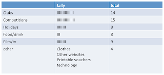
•The third focus group with a different group of 16-25 year olds was a session about the design of the poster
•I found that is should be
•Bold
•Clear as it is only seen for a couple of seconds
•Colourful
•Simple
•Recognisable-same logo as paper
•Flowing
•Mix new with traditional
•Should not be crowded or have to much information.
secondary research into poster design
•Bright fonts stand out on the white background, these bright colours will catch people eyes.
•Includes the simple yet recognisable logo of the guardian
•The poster clearly show that the paper separates “FACT” and “OPINUION” in the way these words are repeated and how they have been placed separately on the page.
•A small paragraph backs this up “opinions are not facts.”
•This poster, again, is simple. Newspaper clipping are used in the background which links it instantly with a newspaper
•Key words and headline are written in a bold white font, “missing” and “ this is war”
• the white contrasts with the use of the brown making the words stand out.
•Key headlines related to news are used, being mainly declaratives which grab the readers attention.
•This poster is a cut out of a masculine hand holding a rolled up newspaper. This is an image that connotes a working class feel which matches the typical reader of the sun
•The paper has a the suns logo on it which is very recognisable and stands out as it is bold white font on a red background
•The cut out of the image stands out as it is on a white background with just a shadow which gives it a life like feel.
•Simple blue background
•Large striking image that stands out. It merges a newspaper and a businessman making it clear what the poster is advertising
•The name of the paper is written in a larger bold font. The white stands out on the blue background
•“men on their toes read” implying that the newspaper is aimed at businessmen, this could be seen as sexist today as you can get business women as well.
•Plain off white coloured back ground makes any text or image stand out once it is placed on it.
•The image is extremely colourful and would capture the eye of someone even from a distance.
•The white bold font stands out on the brightly colour pattern
•Slightly less important information is written in the bottom right hand corner. The black font still allows it to stand out on the white background.
analysis
The majority of poster I have seen in my research use
•A simple un hectic layout
•Colours that stand out on one another
•Larger font for more important information
•Bright colours
•A lack of complicated or busy images
•Bold fonts
•Plain backgrounds
•Only have key information.
•Many of these things were suggested when brainstorming with the small focus group. Because of this i feel my poster will follow alot of these code and conventions as it is clearly what makes an effective poster!!!!
•Its not just modern day posters that aim to be simple and clear. A poster taken from the times newspaper from “Tuesday 26th September 1929” has a simple background with large black font on it which would catch the eye of anyone passing by.
•The times “times new roman san serif font is recognisable to the newspaper
•The headline is written in the largest font
•The times name is written in the same colour as the background but it still stands out as in-between these two layers there is a black layer which make the name of the paper look like it has been created with a stencil, this makes it stand out from the rest of the poster.
I drew out some basic layouts for my poster that only included a small amount of font and some images as i wanted the poster to be simple and clear with not alot of crouded information as this is what both my primary and seconday research suggested.


